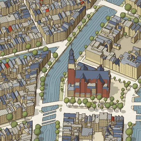
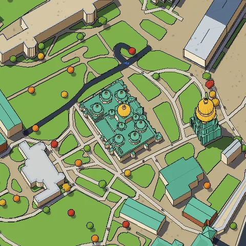
The styles of the map
This article is in English only.Read it in English
Turgot is my favourite style of the atlas, and it is not the default. This is how the eight styles in the menu came about, which ones I deleted, and why most visitors never switch.
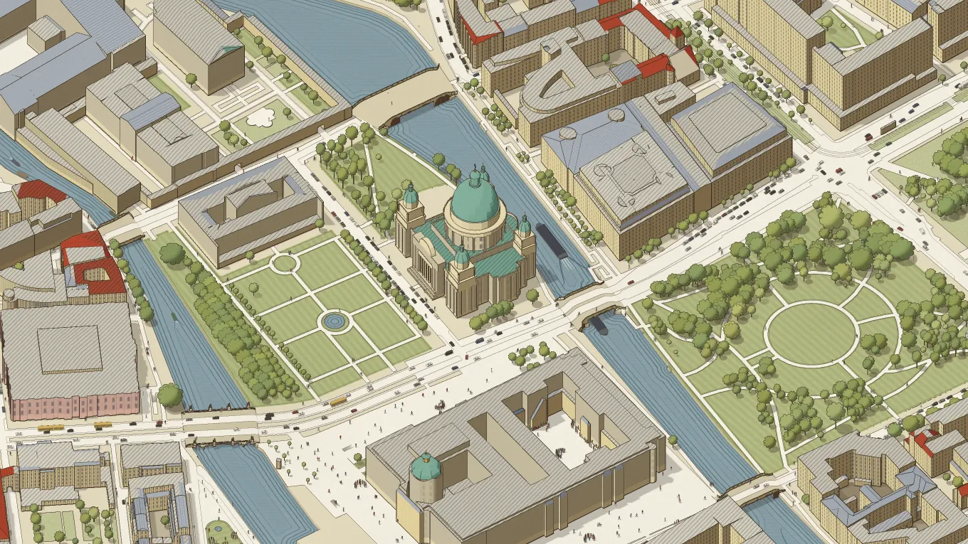
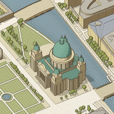
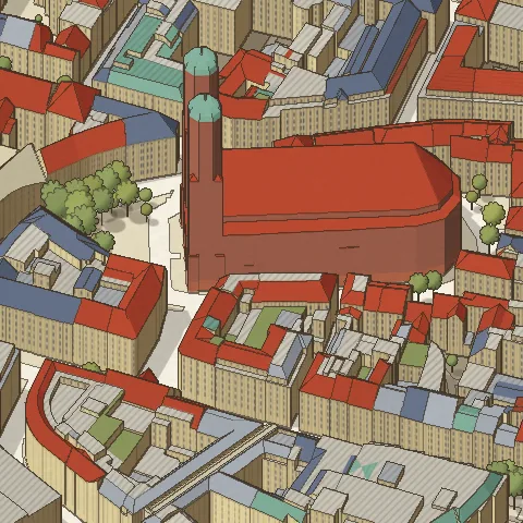
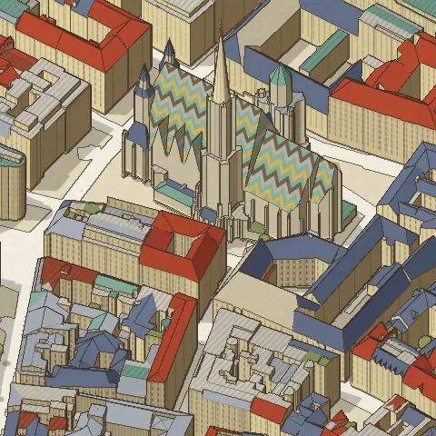
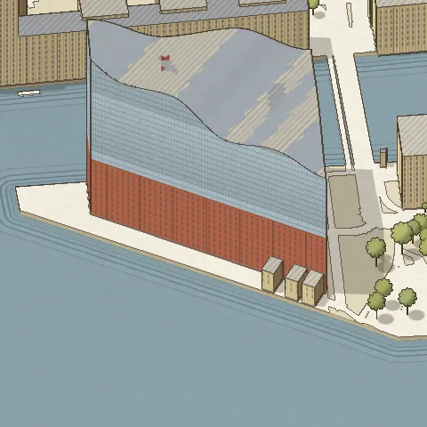
I saw the Plan de Turgot in the Louvre. It is Paris in the 1730s drawn from above with every house and courtyard in it, and the Louvre still keeps the 21 copper plates it was printed from. My first map of Berlin was in that style, and it is still my favourite. Louis Bretez and his engraver spent about five years on it, so of course it looks the way it does.
But Turgot is not the default style on the map, because I don’t want to copy it. I want to make something different, something original in a digital shape. What that means exactly, I am still trying to figure out myself. That is what I am looking for with Atlas Above.
The first styles
Three days after the first map, it had five more styles. That sounds like a lot of work. It was one evening. The map draws every style from the same buildings and streets, so a new style is a different shader with its own colours, and I was playing with shaders. A Nolli plan came out of it, black on white, as Rome was drawn in 1748. Then Ligne claire with flat comic colours, Winter, which is the Turgot plan under snow, and Woodcut, after Schultz’s plan of Berlin from 1688. And also Night, Blueprint and Risograph, which I don’t show anymore, because those last three went the same day.
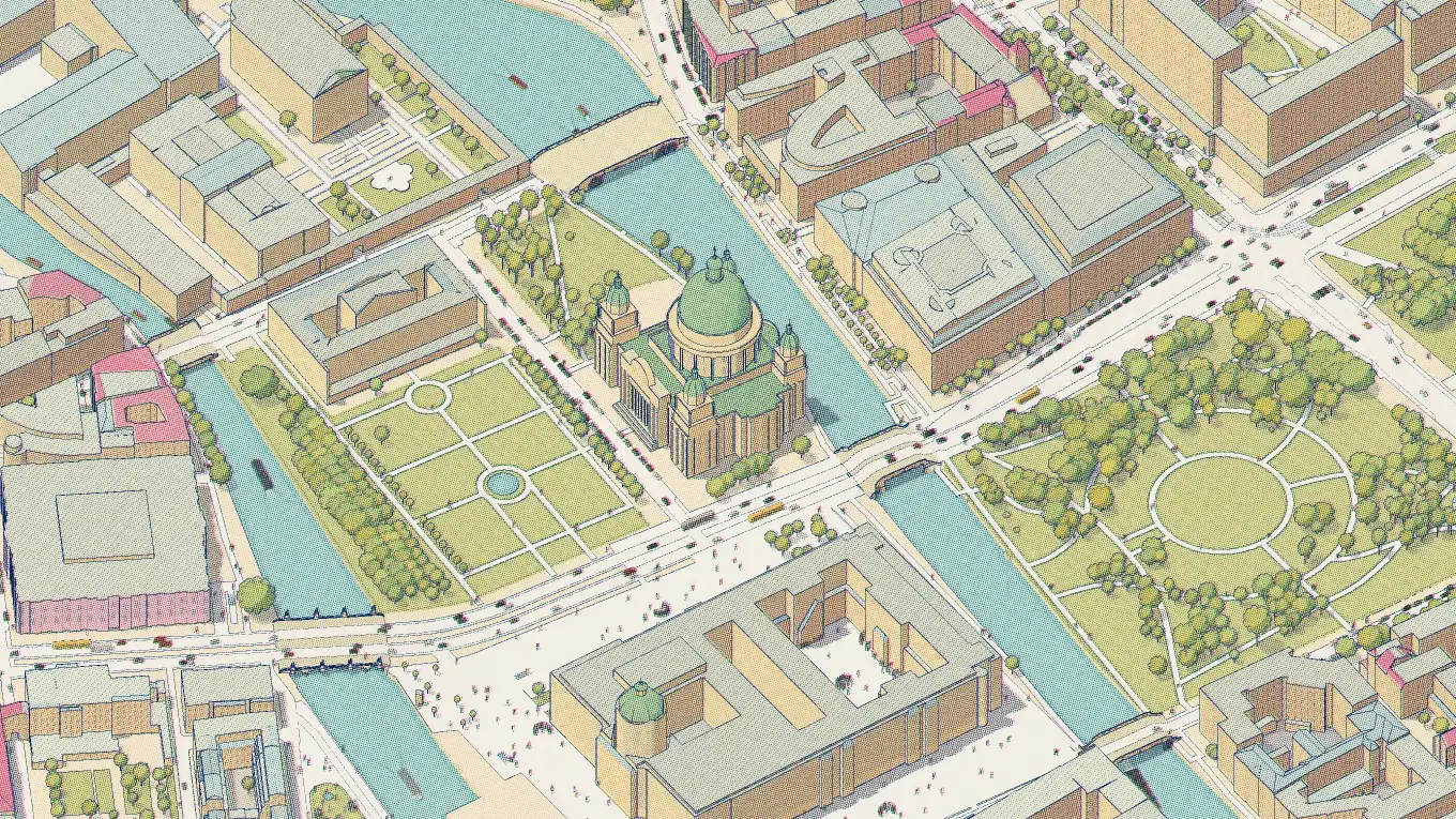
They weren’t very original and I felt their quality was lackluster. Honestly, none of the first six were very different from Turgot. I did a lot of exploration before I settled on styles I like.
The photo
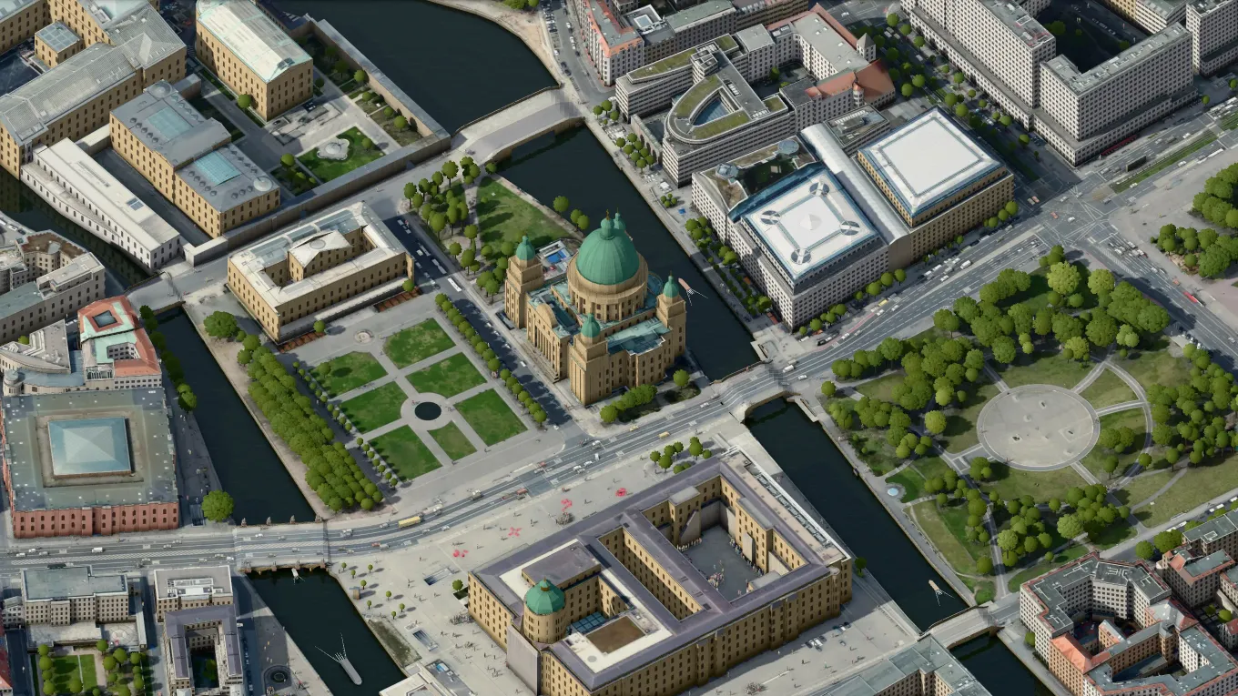
One experiment I liked a lot was an aerial photo style. It streamed the city’s aerial photo from 2024 into the map while you looked at it, with its own sun and the houses mirrored in the Spree. It worked, and I switched it off. The photo is their data and I wasn’t sure about the licence. I also didn’t want such a hard dependency on a third-party service, so it stayed an experiment that I liked and never put on the public site.
Graphic novel
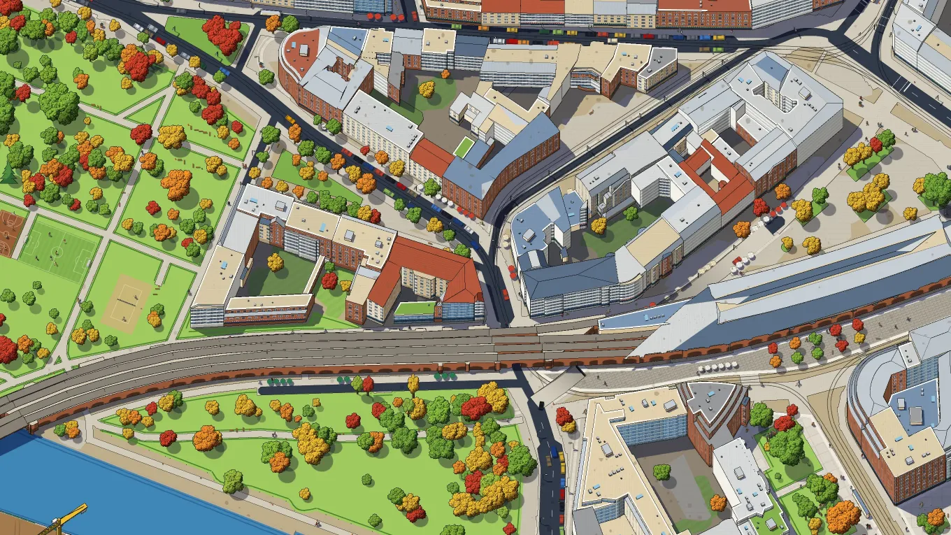
The default is Graphic novel. It lacks some of the details that Miniature and Paper cut have more of, but it explains much better what I am trying to show. Visually. Dark asphalt with white paint, café umbrellas on the pavement, vents on the flat roofs, loud cars, autumn trees. This is how I feel a city. Especially Berlin, where I live now.
Paper cut
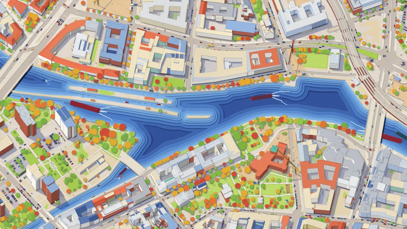
I saw a few pieces of cut paper and it clicked for me: a city made of several layers of paper. On the map every roof is one sheet of colour, every sheet drops a small shadow on the one under it, and the rivers go down to deep water in seven sheets of blue. In Ukrainian the style is called Vytynanka, after the folk craft of cut paper. That is just a cute word I found later, when I added the Ukrainian translation.
Miniature
I am still not sure about Miniature. It shows the city as a model on a table, through a camera with a tilt-shift lens, so the landmark in view stays sharp and the rest goes soft. The first version had a warm golden light. After two paintings of Berlin I changed it to a clear day, and now I think maybe the golden light is what’s missing. I’m still experimenting.
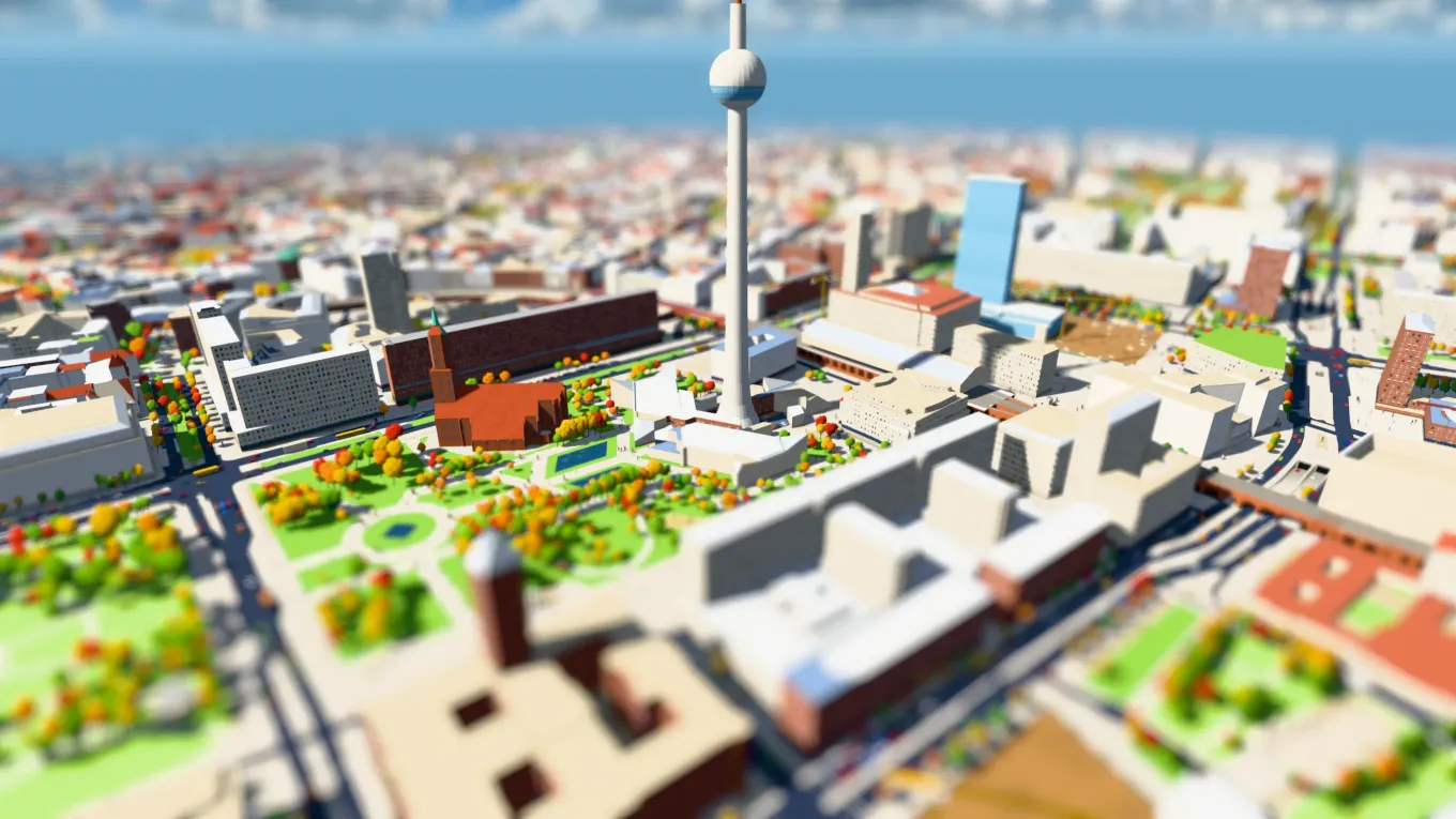
It is also the only style with a lens effect. Drawn styles are very easy to break: they need to be sharp and crisp, and a blur ruins them. Miniature is 3D first, and there such effects are natural.
The visitors
About 80% of the people see the map in Graphic novel and don’t switch. In the first eight days after the launch, 210 of about 1,000 visitors opened another style. In some way I would like them to try the map in a different view, but I let it go. They decide how to look at it. I’m in no position to dictate how they need to see my work.